Two people ship a website on the same afternoon.
The first one describes what they want to an AI, accepts what comes back, and tightens the copy a little. The result is clean. A serif headline, a warm off-white background, a strip of monospace somewhere near the footer, four feature cards in a tidy grid. It looks like it was made by someone who knows what they’re doing. They’re happy with it, and they should be — a year ago that afternoon would have taken a week and a designer.
The second person ships something that makes you stop. You can’t immediately say what tool made it, because it doesn’t look like the tool. The color is wrong in a way that turns out to be right. There’s a character on the page that no template would have suggested. It reads as a decision, not a default.
Here’s the uncomfortable part. The first site isn’t worse because the person was lazy or untalented. It’s worse because they did exactly what the tool is built to help them do: produce the most likely good-looking thing. And the most likely good-looking thing is, by now, the thing everyone else is also shipping.
If you make things with AI — copy, a landing page, a logo, a product, a pitch deck, a post — this is for you. Not because you’re doing it wrong, but because the move that feels like winning is quietly the move that makes your work disappear into everyone else’s.
The belief everyone’s operating on: AI democratized “good”
The story we’ve all been telling each other is a genuinely nice one, and it’s mostly true. AI took skills that used to be gated — writing clean copy, laying out a page, drafting a clause, naming a thing — and handed them to anyone who can describe what they want. The floor came up. A solo founder can now ship something that, two years ago, would have needed a small team. A non-designer gets a designed-looking site. A non-writer gets writing that scans.
That’s real, and it’s worth saying plainly so we don’t pretend otherwise: the polish is no longer the hard part. You can get professional-grade output on the first try, for almost nothing, in almost no time.
The belief that rides on top of that — the one almost everyone is quietly operating on — is this: because I can now produce polished, professional-looking work, I’m producing something good. Polish got democratized, so quality did too. The playing field got level.
That second step is where the trouble hides.
The crack: the polish stopped being a signal of quality and became a signal of the machine
Something shifted in the last year, and it shifted fast enough that you may have felt it before you named it.
The clean, capable AI-default look stopped reading as “this person knows what they’re doing” and started reading as “this was made by a machine.” Designers gave it a name. By early 2026 there was an open backlash — an “anti-vibe-coding” pushback, with agencies and brands deliberately swinging toward raw, tactile, high-contrast design specifically to prove a human made the choices (Medium, May 2026). The convergence got concrete enough to describe from across a room: gray cards with subtle borders, neutral palettes, a clean sans-serif, a sidebar on the left, a data table in the middle, a button group top-right (Bhuwan Garbuja, “Why every AI-generated website looks exactly the same”). One design tool put the mechanism in a single sentence: “every Claude Code and Codex user is pulling from the same default aesthetic training data — and getting back the same median output” (Shuffle, Jan 2026).
It isn’t only websites. The same thing happened to writing, and there it got a punctuation mark for a mascot. The em-dash — sprinkled through a paragraph at a rate no tired human would manage — became one of the defining tells of machine-written text, to the point where people now read a clean, evenly-cadenced paragraph and think a model wrote this before they’ve finished it (Context Link). The model learned that em-dashes show up in sophisticated writing, so it reaches for them constantly, not understanding that constant reach is itself the giveaway.
So here’s the crack in the nice story. The polish that used to mean a skilled person made this now, increasingly, means a model made this and nobody changed it. Same surface, opposite signal. The thing that was an asset became a tell.
The turn: the model doesn’t hand you “good,” it hands you the average — and the average is now invisible
Here’s the part nobody says out loud: an AI model isn’t built to give you something good. It’s built to give you something likely. Those are not the same thing, and the gap between them is the whole story.
When you ask a model for a website, or a headline, or a logo, it doesn’t search for the best possible one. It returns the most probable one — the center of everything it has seen, the answer that sits where the most training examples pile up. On any single task that center is genuinely competent, which is exactly why it fooled us. But “the most probable competent answer” is, by definition, the answer most likely to match what the next person gets when they ask the same thing.
And the models don’t just lean toward that center — they’ve been sharpened into it. The training step that makes a model pleasant to use also teaches it to favor the familiar, fluent, expected response over the surprising one. Researchers traced this to what they call typicality bias: when human raters pick between answers, they systematically prefer the conventional one, independent of whether it’s actually better. Train on that preference and the model’s output gets mathematically narrowed toward a single dominant mode — they measured the effect and found it strong and unmistakable (α̂ = 0.57, p < 10⁻¹⁴) (Verbalized Sampling, arXiv 2510.01171). In plain terms: when several answers are about equally good, the model is built to pick the most ordinary one. Out of the box, it doesn’t reach for the interesting tail of what it knows — it collapses to the middle.
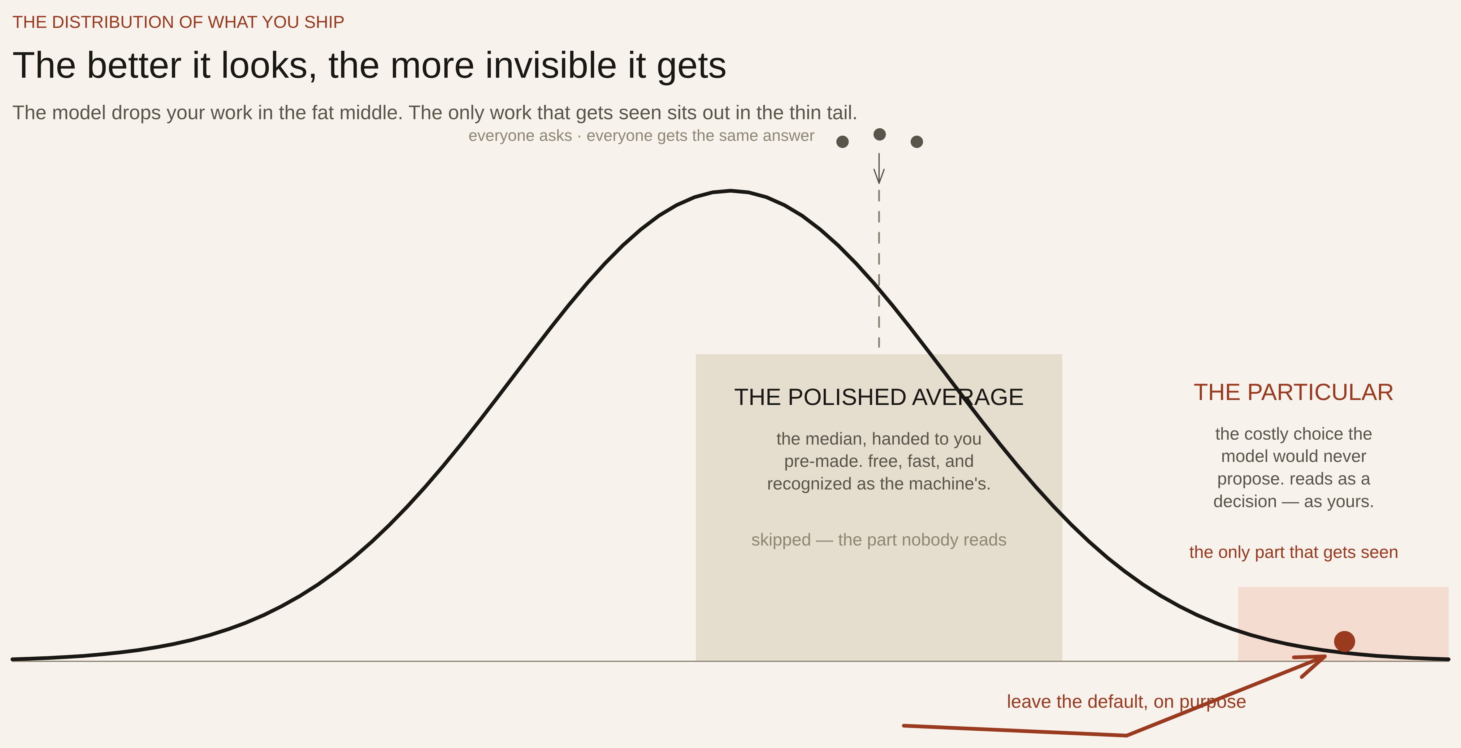
So the polished thing you got isn’t your good work made easy. It’s the field’s average, handed to you pre-made. And the moment your output is in that average — in-distribution, indistinguishable from the median — it stops reading as a choice anyone made. It reads as output. The better it conforms to the model’s default, the less it reads as yours.
That’s the turn. The polish you’re proud of is the camouflage. The more your work looks like what the model wants to make, the more invisible it becomes.
Why “average” is fatal and not just unremarkable
You could read all that and shrug: fine, it’s average, average is acceptable, I’ll stand out on substance. But average is worse than unremarkable now, for two reasons that have actually been measured.
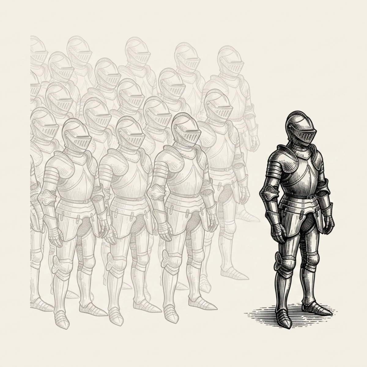
The first is that the average is collapsing inward, not holding steady. When lots of people lean on the same model, their collective output gets more similar, not less. In a set of studies comparing human-written and GPT-4-written essays, the human essays added roughly two to eight times more collective diversity to the pool than the AI ones — and the gap widened as more essays were added, because each new AI essay kept landing near the same center (Trends in Cognitive Sciences, 2026; Doshi & Hauser, Science Advances-adjacent work summarized at ScienceDirect). The mechanism is the same one underneath: a model predicts the most likely continuation, so it pulls everyone toward the dominant style in the data and the genuine outliers thin out (Improving Linguistic Diversity, arXiv 2412.03343). The “average” isn’t a fixed midpoint you’re safely matching. It’s a crowd, getting tighter, and you’re in it.
The second reason is the one that should actually change your behavior: people don’t just fail to notice default work — they actively dock it once they suspect a machine made it. In the largest study of its kind, 27,491 people across 16 experiments rated identical creative writing lower the moment they were told an AI wrote it. The researchers tried hard to make the penalty go away — they gave the AI a name, called it highly capable, changed the genre, changed the judging instructions — and nothing worked. “The surprise to us was how persistent the effect was,” one author said. The driver they isolated was perceived authenticity: machine-made simply reads as less authentic, and authenticity is what people were rewarding (Journal of Experimental Psychology: General, April 2026, via PsyPost).
Put those two findings together and the picture is sharp. The default look is converging, so it’s easier than ever to recognize. And the moment it’s recognized as machine-default, it’s discounted. Your polished, in-distribution work isn’t landing at “fine, average.” It’s landing at “oh, this is the AI one” — and getting marked down for it.
Picture it as a bell curve. The model is built to drop your work in the fat middle, where the most examples already sit and the most other people are also landing. That middle isn’t neutral ground anymore. It’s the spot readers have learned to glance at and skip. The only work that reads as a choice — as yours — is the work that sits out in the thin part of the curve, where the model would never have put it on its own.
The only escape is the one the model resists: deliberately leave the default
If staying in-distribution is the problem, the move is obvious to say and uncomfortable to do: get out of the distribution on purpose.
Not by accident, and not by adding more polish — polish moves you toward the center, because the center is what “polished” was trained on. You get out by making the specific, costly choices the model wouldn’t default to. Pick the color it would never propose. Keep the cadence a tired human actually writes in, em-dashes rationed, sentences uneven. Put a character on the page that no template suggests. Choose the structure that’s harder to build but yours.
Researchers found you can even coax a model partway out of its own rut — ask it for a range of answers with their probabilities instead of “the” answer, and its diversity jumps 1.6 to 2.1 times, because you’ve given it permission to use the tail of what it knows instead of the mode (Verbalized Sampling, arXiv 2510.01171). That’s a useful trick. But notice what it confirms: left alone, the model returns the mode. The interesting material was always in there — it just won’t hand it over unless you deliberately reach past the default. The reach is the work. It’s the part that isn’t free, isn’t fast, and isn’t suggested to you. Which is exactly why, when you do it, the result reads as a person and not as output.
This is what a real identity is for, and it’s worth being precise about the word. An identity system isn’t decoration you apply at the end. It’s a set of standing decisions to step out of the default — the same step, made the same way, every time — so that everything you ship lands in the thin part of the curve on purpose instead of the fat middle by accident.
What this looks like when you actually do it
This essay is published under a name and a look that exist for exactly this reason, so it’s only fair to show the work rather than gesture at it.
The Augmented Work could have shipped the in-distribution version of itself. The serif, the warm off-white, the calm monospace accent — the look you’d get if you asked a model for “a thoughtful publication about AI and work.” It would have looked competent. It would also have looked like the forty other thoughtful publications about AI and work that got the same answer from the same model on the same afternoon. It would have been invisible in precisely the way this whole piece is about.
So the identity is built to refuse that. There’s a knight — an actual mascot, a character, the kind of specific human choice a model proposing “a thoughtful publication about AI” would never land on. The palette is limestone and oxblood: a pale, dry stone and a deep dark red, a pairing the default would not reach for, and would probably soften if you let it. None of those choices are “better” in the way the model means better. They’re more particular — further from the center, harder to mistake for the median, and impossible to confuse with the tool that helped make them.
That’s the whole point. The goal was never to beat the model at producing average work. It was to never produce average work in the first place — to make a standing decision to live in the tail.
The shift, plainly
So go back to the two people shipping a website on the same afternoon.
The first one did everything right by the old rules. They got clean, professional output, fast and cheap, and they shipped it. The rules just changed underneath them. In a world where everyone can summon the polished average, the polished average is the one thing guaranteed not to be seen — recognized as the default, discounted as the machine’s, skipped as the part of the curve nobody reads anymore.
The second one paid for something the first one got for free, and got back something the first one couldn’t buy: work that reads as a decision. That’s the trade now. The default is free, and being free is exactly what makes it worthless as a signal. Anything that reads as yours has to cost a deliberate step away from what the model wanted to hand you.
You’re not being asked to work harder for its own sake. You’re being told where the value moved. It moved out of the polish — the model owns that now — and into the particular: the specific, slightly-uncomfortable, won’t-be-suggested-to-you choice that the model is built to avoid and a person has to make on purpose.
The next time something you made comes back clean on the first try and you feel that small hit of this is good — pause on it. Clean on the first try is the model handing you the middle of the curve. The good part, the part that will actually get seen, is whatever you do next to get out of it.
Sources
- 1Zhang et al., “Verbalized Sampling: How to Mitigate Mode Collapse and Unlock LLM Diversity”, arXiv 2510.01171 — typicality bias sharpens models toward the mode (α̂ = 0.57, p < 10⁻¹⁴); verbalized sampling recovers 1.6–2.1× diversity.
- 2“The homogenizing effect of large language models on human expression and thought”, Trends in Cognitive Sciences (Cell Press), 2026.
- 3“Homogenizing effect of large language models (LLMs) on creative diversity”, ScienceDirect, 2025 — human writing added ~2–8× more collective semantic diversity than GPT-4.
- 4“Improving Linguistic Diversity of Large Language Models with Possibility Exploration Fine-Tuning”, arXiv 2412.03343 — LLMs predict the most likely continuation, aligning output with dominant styles and underrepresenting outliers.
- 5Raj, Berg & Seamans, “The Artificial Intelligence Disclosure Penalty”, Journal of Experimental Psychology: General, April 2026 — 27,491 participants, 16 experiments; persistent devaluation of work believed AI-made; perceived authenticity the strongest driver (summarized at PsyPost).
- 6Shuffle, “Why Do Most AI-Generated Websites Look the Same?” Jan 2026 — “every Claude Code and Codex user is pulling from the same default aesthetic training data — and getting back the same median output.”
- 7Bhuwan Garbuja, “Why every AI-generated website looks exactly the same” — named the convergent design signatures; the shadcn/default-component mechanism.
- 8“The ‘Anti-Vibe Coding’ Movement”, Medium, May 2026 — the designer-led backlash; tactile/brutalist pivot to prove human authorship.
- 9Context Link, “Claude Em-Dash Problem” — the em-dash as a recognizable machine-writing tell.